Navionics chart question

The friendliest place on the web for anyone who enjoys boating.
If you have answers, please help by responding to the unanswered posts.

senangsekali

Senior Member
Joined
Jun 19, 2017
Messages
216
Location
Canada
Vessel Name
Senang Sakali
Vessel Make
North Sea 37
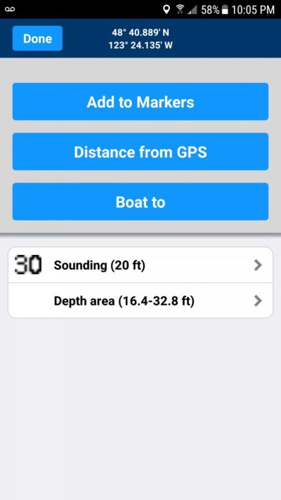
I have two lowrance chartplotters on my boat and also a tablet so i can take to the fly bridge. My tablet maps show different depths on the chart whem compared to my lowrance plotter. It show 30 ft on the chart but when i get details on the depth is says sound 20ft. What is going on with my maps. Is there something im missing? Screenshot_20171130-220530.jpg
 
You tapped on a spot sounding.

If you look at raster (paper) charts, you'll notice that there are more (and possibly different) spot soundings on larger scale (more detailed) charts. Each of these, along with it's lat/long, is entered into the electronic (vector) chart.

When you tap on the electronic chart, you can display whatever is at that lat/long. Usually there is more than one thing. In the case above, there's the spot sounding (30') and the "depth area," probably the area between contours, of 16.4 - 32.8'.

Sometimes there are lots of things where you tapped. Maybe you're in a regulated zone, in a bay, in the ocean, in a state, in a country, etc. That's why you're shown a list of things.

Right next to your 30' spot could be a spot sounding from a different scale chart, recorded during a different survey, which could have been performed decades before or after the survey that recorded that 30' spot.

One of the drawbacks of vector charts is that they "flatten" all the data from all these various scales into one electronic chart.

It gets worse. Maybe the small bay you want to anchor in was labeled on one scale chart off to the right of the bay. On another chart, there was more room on the left side. When these charts are digitized, the lat/long of that label (the name of the bay) shows up twice, in two different places. Or maybe they just deleted one, leaving the one from the smaller scale (zoomed out) chart, which was only placed there because it fit nicely into some white space on that particular chart. So now the name in the vector chart is nowhere near the bay.

Understanding the limitations of vector vs. paper or raster charts is important.
 
Hi Senangsekali,

I firmly second CaptTom's final statement: Understanding the limitations of vector vs. paper or raster charts is important. The choice of charting software, and the choice of vector vs raster charts (or paper) is a very personal decision, well beyond the scope of this discussion. That choice has been discussed ad nauseum, and is simply one that cannot be "crowdsourced". Accordingly, my comments are limited.

I have witnessed a Navionics vector display on both an IPad and a Raymarine display, both fully updated within 6 months of arrival, at 57 deg 43.7 min N, 134 deg 06.4 min W that completely "lost" Buck Island. The display simply showed the two awash rocks north and south of the island. The island itself is approximately 20 acres in size, fully exposed at high water, and obvious as the ass on a goat if you're close aboard in good weather. At exactly the same time, on a different boat (mine) this island is fully displayed on the appropriate NOAA cartography (either vector OR raster), when displayed with Coastal Explorer.

How does Navionics "lose" an island? Personally, I'm leery of any electronic software that makes use of proprietary cartography, and chose to put myself at the mercy of native-mode (unadulterated) NOAA cartography, bathymetry, my depth sounder, and my MK-1 eyeball 100%.

YMMV.

Pete
 
I'm an old navy navigator and prefer raster charts for the additional info. I use TZNavigator and OpenCPN. In the past, TZNavigator, (proprietary charts) has sent raster charts with metric data instead of fathoms/feet. Operator can choose measurement system on vector charts. The proprietary charts are made with a 3d function I never use. TZNavigator won't use NOAA charts directly unless I upgrade to a more expensive system. Looking for something else that also allows direct plotting of LOPs, radar ranges, and star sightings that doesn't require a mortgage.
 
How does Navionics "lose" an island?

Pete poses a good question. I have a theory.

Part of my theory was explained above; multiple raster charts are digitized onto one "flat" vector chart, with different layers.

This isn't an automatic process. Someone has to actually LOOK at the chart and decide which label goes with which feature. Which features go in which layer. There must be some priority attached to each layer, so when you zoom out, less important features are hidden so it doesn't become a blur of objects and labels.

These are all judgement calls. Mistakes are inevitable. In fact, they're pretty common, as Pete found out.

Remember that the paper charts developed over may years (in some cases, centuries) and were kept updated by a long line of experts in cartography and navigation. There is a lot of collected wisdom in those charts. Errors were identified and corrected by the next updater.

You risk losing that collected wisdom in the digitizing process. Especially if it's done by one individual, probably less experienced, underpaid and possibly in a foreign country far removed from the location being charted.

This is why, at some zoom levels, you lose the name of the large town, the harbor, and the islands, but the name of some minor inland swamp or hill still displays. Clearly whoever made the decisions about digitizing and prioritizing had no clue about the area.
 
Hi CaptTom,

I believe you're on the right track regarding how proprietary vector charting is produced. Clearly, no commercial enterprise (Navionics, Nobletec, Jeppeson, etc.) can muster the manpower to duplicate the vast taxpayer dollars spent by NOAA to date in order to generate the native digital cartographic and bathymetric data. The commercial enterprises must start with NOAA information, and add their bells and whistles from there. Someone, somewhere within the commercial enterprise must take the native NOAA data and make decisions on what is displayed (land masses, depth, navigational objects, etc.), where it is displayed (i.e.-what layer), how it is displayed (colors, for instance) within their own software. These bells and whistles are the value-added features that customers chose when they buy commercial electronic charting software.

In the case of Buck Island, the cartographic data necessary to display the island is clearly within the current NOAA database. While the NOAA layering convention is unknown to me, I would presume that NOAA provides the Buck Island cartography on the same layer as the surrounding coastline of Admiralty Island. So how can Navionics REMOVE the digital data concerning this specific land mass while generating their own, proprietary versions of that data? I can see moving information to different layers to suit their idea of what the user needs/wants to see at any given time, and adding layers of information perhaps provided by third-party suppliers (wind vectors, for instance). But REMOVE it? No, I don't think anyone is that dumb.

I betcha that Nobeltec's database is simply WAY out of date, at least for that specific region. And I believe you'd have to go back to pre-2012 NOAA data to find Buck Island absent from the cartography. Perhaps WAY back...

Danger, danger, danger! If they missed THIS island, what ELSE have they missed? And by the way, this issue has been reported to Navionics, who are "looking into the issue". I'm not holding my breath. But again, YMMV, and it's certainly each person's choice how to deal with the age-old mantra of the mariner that "water good, dirt bad".

While slightly off-topic (sorry!) I got in a significant email disagreement with the previous owner of Active Captain that the US Govt should get out of the bathymetry business, and let crowdsourced bathymetry data lead the way (via Active Captain, of course!). It'll be interesting to see how Garmin treats this subject in the future. Sorry, pass.

Regards,

Pete
 
Hi Senangsekali,

I firmly second CaptTom's final statement: Understanding the limitations of vector vs. paper or raster charts is important. The choice of charting software, and the choice of vector vs raster charts (or paper) is a very personal decision, well beyond the scope of this discussion. That choice has been discussed ad nauseum, and is simply one that cannot be "crowdsourced". Accordingly, my comments are limited.

I have witnessed a Navionics vector display on both an IPad and a Raymarine display, both fully updated within 6 months of arrival, at 57 deg 43.7 min N, 134 deg 06.4 min W that completely "lost" Buck Island. The display simply showed the two awash rocks north and south of the island. The island itself is approximately 20 acres in size, fully exposed at high water, and obvious as the ass on a goat if you're close aboard in good weather. At exactly the same time, on a different boat (mine) this island is fully displayed on the appropriate NOAA cartography (either vector OR raster), when displayed with Coastal Explorer.

How does Navionics "lose" an island? Personally, I'm leery of any electronic software that makes use of proprietary cartography, and chose to put myself at the mercy of native-mode (unadulterated) NOAA cartography, bathymetry, my depth sounder, and my MK-1 eyeball 100%.

YMMV.

Pete

That's a great strategy when you are in the US. But it's a big world out there.
 
Hi,


Navicons gets all the map data from around the world from local official posts, in addition to negligence errors. I use FLS to track bottom shapes and depths. Navicons map and reality very often contradict. You can watch the link video and pay attention when i go from the top of the dark blue low water, so the map looks radically smaller than it really is. In this case, does not matter, because ok deep my boat, but I have found a dangerous points on the map that are not labeled.

I rely more on my FLS than the paper or navicons map, of course I also follow them, but the rock character on the paper is 210 feet in the reality sea and possible positioning errors, i think the navicons rock sign + is reality sea on the zoom area 1/2-1 1/2nm can be even bigger maybe 500-700 or more feet.

My speed 8,2kn chart range 1/2nm deep number metric


https://vimeo.com/241873955


Nbs
 
Last edited:
A couple of points. Over on the OCPN forum I learned that layers are NOT prioritized. From using them, I know you can turn some layers on and off. Apparently the layers are for different categories of data. Not for priority within a category. For example, the name label for the harbor is no higher priority than the name of the small bog a mile inland.

I'm still trying to get my mind around how professional cartographers (this is their ONLY job!) somehow forgot that every map and chart ever made has some features in a larger or bolder typeface than others!

But it explains a lot about why ENCs handle place names so poorly.

Finally, a comment about what value electronic chart vendors add for the big $$ premium they charge over government charts.

Right now, it's all totally useless to me. I don't need some corporation to tell me where there are good fishing holes, or anchorages, or how to get to their paid sponsors' facilities. And I certainly don't need to pay for the privilege of having them add it to the free (in the US) ENC data.

Admittedly, that may change in the future. There are a few companies out there trying to crowd-source depth data, for example. When (if) that data ever becomes better than the government's data, I'd be willing to pay for it. But keep in mind that most crowd-sourced data is going to cluster around larger harbors. The kind that are already well charted.
 
It is unfortunate that the island is missing. However, at least Navionics gives us boaters the power to update them ourselves through Community Edits. When I've run across an issue like this (admittedly never an entire island missing) you can click on the chart at the location it should be and add the correct information which will be added to the chart.

Also, have you updated your chart? When I go to that way point this is what I seeScreenshot_20171223-040538.jpg
 
This is an interesting thread. It would seem my pile of paper charts covering Tacoma to Glacier Bay is worth keeping and using. In fact the old fashioned notion of following buoys and land masses on these tattered charts may be of benefit.
 
This is an interesting thread. It would seem my pile of paper charts covering Tacoma to Glacier Bay is worth keeping and using. In fact the old fashioned notion of following buoys and land masses on these tattered charts may be of benefit.
I also like my paper charts. I found that the Nobletec Time Zero app on my IPad gives me all raster (paper charts) for North America for $50. Hard to beat that. although I still can’t get rid of the actual paper.
 
How often are the paper charts updated?

Silly as this may sound, how often do land masses move? The issue as raised earlier is Buck Is disappeared when viewing Navionics. US government charts are now using crowd sourced data for updates. This is a good step but practically how useful on a short term basis.

But to wait for boaters' new verified data to get downloaded and then hit my systems for my infrequent computer and plotter updates is of little use when navigating from Lisianski Strait to Sitka this coming summer. My 3 charting systems, radar, eyes and paper charts will all be in use.
 
Silly as this may sound, how often do land masses move?

Usually, not often. But a river delta or sand bar often moves a lot.

Those are known hazards. But a lot of changes include newly reported rocks. How do you think they come to be "reported?" Do YOU want to be the one who reports them?

Then there are the buoys which are changed, moved or discontinued. Lights and fog horns are changing all the time as new technologies are deployed.

Fish farms are established, offshore wind farms and gas offloading stations are built. Bridges are worked on and rebuilt. Harbors are dredged.

Just look at all the changes on any weekly LNM. Are you going to remember them all? It's so much simpler to have an update chart (paper or electronic.)

Yes CT, as you note changes are occurring all the time. In the old days (pre on line instant charting gratification) it was not difficult keeping up with bridge, river and buoy changes. Of course way back then we didn't have the marketers telling how often things change so buy product X or Z. Fascinating how the Admiral's sharp eyes and attention to the VHF see and hear of these changes.

But the essence of my and Lepke's posts are a land mass happening as (not or mis ?) reported on Navionics.

Also note I said I use all available data, which includes electronic systems and paper charts. Lastly, your are correct, it is amazing how often boats run/anchor aground on "uncharted" clearly visible rocks, especially in the 15 to 20 foot PNW tides areas.
 
I know that Navionics has about 2000 updates a day to their charts. Granted, that's world wide but apparently there can be lots of changes. And I know in my area in Florida there can be a Lot of changes. I can dive one of my favorite wrecks one day and it's fully exposed and then a week later after a good storm it's completely covered again!
 
I also like my paper charts. I found that the Nobletec Time Zero app on my IPad gives me all raster (paper charts) for North America for $50. Hard to beat that. although I still can’t get rid of the actual paper.

Does this include Canadian charts? I know the US charts have largely been made available to print yourself for free, but I still see a minimum of over $300 for any bundle of Canadian charts, especially the detailed ones for the BC upper coast.
 
Does this include Canadian charts? I know the US charts have largely been made available to print yourself for free, but I still see a minimum of over $300 for any bundle of Canadian charts, especially the detailed ones for the BC upper coast.
I mis spoke on that. The charts for USA are $49.95 and Canada is an additional $49.95. (Canadian covers East coast, West coast, and Great Lakes.) I tried but cannot correct my previous post.

For clarification you can’t print the charts from Nobletec (I don’t think?) but they are all available to be downloaded to your IPad as needed, once you have paid.
 
I have “iNavx” navigation software on my iPad together with A) NOAA Raster Charts for the PNW, B) CHS Raster Charts for British Columbia and C) Navionics “2XG Canada” Charts for the PNW. I also have Coastal Explorer with the A) NOAA Raster and ENC Charts for the PNW, B) CHS Raster and ENC Charts for British Columbia.

I’ll comment on the “Crowd Sourcing” by Navionic below, but it’s important otherwise that we realize that for any given location, ALL NAVIGATION PROGRAMS USE THE SAME SOURCE DATA, WARTS AND ALL. It doesn’t matter if you have Nobeltech’s “Wizzy” 3D representation of the seafloor, it uses no more information than what is displayed on the highest resolution raster charts for any given location. At least I know that to be true in Canadian waters. Others can comment on US waters.

So what are the warts?

It starts with how the coastline has been drawn on the raster charts; in particular locations on the coast surveyors determined the “horizontal datum” (or, the plural form “horizontal data”): i.e. “precise” determinations of the exact locations of “points” on the shore. These were marked by brass plugs inserted into the rock. They then marched around the shoreline and completed the shoreline survey by triangulation and “drew” the shoreline. Next they sent some guys out in boats, who took “leadline” measurements and they made “fixes” of the vessel in the water RELATIVE TO THE SHORELINE “DATA” LOCATIONS. If there is bias in the determined location of the Horizontal Datum, that bias will be propagated through the entire part of the chart that is based on that determination.

So, how “precise” is “precise”? It turns out sometimes “NOT VERY”. Consider the statement on CHS Raster Chart 3726 just below Higgins Passage: “Recent surveys in the general area of Price Island, and in particular Higgins Passage, indicate that horizontal position discrepancies in the order of 150 m may exist. Mariners should use caution when navigating in these areas.” So some of you might say: Those are raster charts and I use ENC’s! Well on Coastal Explorer you can switch back and forth between the two types of charts and at least for my boat, its position does not change when referenced to land features on the charts.

Now, if you use the raster charts as they were intended, none of this maters, because you’d take some of compass fixes on two or more reference points on land and you’d “triangulate” your position “relative” to those points. But with GPS, everything’s changed because your boats positon relative to the geostationary satellites is “different” than what would be “referenced” from the paper chart.

So, what about “Crowd sourcing”? I am deeply suspicious about it, at least for now. Perhaps I can be convinced otherwise. Crowd sourced information comes from people whose equipment has not been calibrated for accuracy and precision. Is the transducer’s position known with accuracy? Is its orientation exactly vertical? Have the soundings been corrected for “Pitch, Roll and Yaw”? (NB: if the soundings have not been corrected for pitch roll and yaw, the depths will be overestimated.) You might say that if you have enough “observations” you could discard the outliers from the data but as always the devil is in the details.

Enough already! I’ll close my comments with a screen capture from Coastal Explorer that I’ve posted before of the AIS target of the CHS Survey Vessel Otter Bay traveling over land at Murchison Anchorage!
 

Attachments

  • CCGVOtter Bay over a reef.jpg
    CCGVOtter Bay over a reef.jpg
    114.6 KB · Views: 61
I have seen class B AIS targets also cross over land. I attributed that to the fact that they only broadcast their position every so often. So in theory when approaching a spit of land or an island for example they (the AIS) broadcast its position. Then they travel around the island or spit of land and the (AIS) broadcast its position again. The Track will show a straight line from the first to the second broadcast positions. Right over the island or spit of land. Plausible?
I am open for correction

A 30 second transmit cycle for Class B. I would hesitate to even call these lines "tracks". More of a visual aid to connect the same owner of the positions, than a track. A lot can happen in 30 seconds at 20kts, and if that packet is lost, you now at 60 seconds.

No. It's a Canadian Coast Guard Vessel that is tasked with doing the hydrographic work for the Canadian Hydrographic Service with a need for the best GPS and it will have Class "A". I watched the whole transmission and it transmitted every few seconds as it left the anchorage. I talked about it with the crew of this vessel earlier before they left and they confirmed the problem with shoreline on the chart. I also went by the spot in my skiff and verified the issue with the iNavx app on my iPad. This IS NOT AIS error, but rather horizontal position error on the charts.

Jim
 
Last edited:
Back
Top Bottom