mvweebles
Guru
- Joined
- Mar 21, 2019
- Messages
- 7,796
- Location
- United States
- Vessel Name
- Weebles
- Vessel Make
- 1970 Willard 36 Trawler
On another thread about going between Seattle and San Diego, topic of Pilot Charts surfaced. Thought I'd start an informational thread.
A common question on sailing sites is "What's the best time of year to go from Point A to Point B?" Well, here's how you know - it's the foundational information for many sites, including Noonsite and the closely associated Cornell's World Cruising Routes (Jimmy Cornell was the architect of Noonsite.com).
What are Pilot Charts? They are not really a navigational chart at all but rather a historical collection of weather in a region (South Pacific, North Pacific, etc. - all the worlds' oceans). Each region has a separate chart for each month of the year. The charts have clever annotations showing what the aggregate weather observations have been for each 5-degree square (300nm x 300nm).
Pilot Charts are free and located free for download located HERE.
One of the best reasons to use traditional charts is they are good reading. Pilot Charts are no different - a wealth of information. They compile many years of observations though have not been updated in over 25-years.
Two pictures attached.
1. Windrose. TF Member KSanders is working his way from Alaska to La Paz in his Bayliner 4788. Guessing that sometime next month he'll pass San Francisco so I grabbed a screenshot of the area for July.
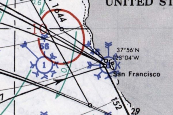
HOW TO READ WINDROSE:
- Number of 'fletches' (half-feathers) corresponds to Beaufort Scale. Length of arrow indicates frequency. 56% of the time, conditions are Force 5 (17-21 kts, 4-8 foot seas) from the north, and almost all the rest of the time it's Force 4 (11-16 kts wind, 1-4 foot seas) from the NW. Small scattering of other observations. The number in the center is percentage of calms 1% in this example.
- Solid RED line. This indicates frequency of seas in excess of 12-feet. Less than 10% for this area.
- GREEEN arrows. Ocean currents. Around 0.4 kts in this example.
- DASHED LINE - barely visible, but this is the percentage of times where visibility is under 2nms (fog). Under 1% in this example.
2. Second picture is GALES, an inset chartlet (A Gale is defined as Force 8 - 34-40 kts with 18-25 foot seas, some breaking).
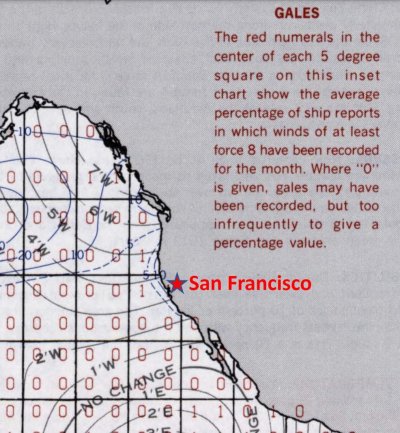
The "Gales" chartlet gives two important pieces of information: frequency of a Force 8 Gale (zero in this example for July, though a peak at the January Pilot Chart shows an increases to 8%); and periods of reduced visibility (fog) - the blue lines, which is 1% for this area in July (10% in January).
I love traditional charts. Great reading.
Peter
A common question on sailing sites is "What's the best time of year to go from Point A to Point B?" Well, here's how you know - it's the foundational information for many sites, including Noonsite and the closely associated Cornell's World Cruising Routes (Jimmy Cornell was the architect of Noonsite.com).
What are Pilot Charts? They are not really a navigational chart at all but rather a historical collection of weather in a region (South Pacific, North Pacific, etc. - all the worlds' oceans). Each region has a separate chart for each month of the year. The charts have clever annotations showing what the aggregate weather observations have been for each 5-degree square (300nm x 300nm).
Pilot Charts are free and located free for download located HERE.
One of the best reasons to use traditional charts is they are good reading. Pilot Charts are no different - a wealth of information. They compile many years of observations though have not been updated in over 25-years.
Two pictures attached.
1. Windrose. TF Member KSanders is working his way from Alaska to La Paz in his Bayliner 4788. Guessing that sometime next month he'll pass San Francisco so I grabbed a screenshot of the area for July.

HOW TO READ WINDROSE:
- Number of 'fletches' (half-feathers) corresponds to Beaufort Scale. Length of arrow indicates frequency. 56% of the time, conditions are Force 5 (17-21 kts, 4-8 foot seas) from the north, and almost all the rest of the time it's Force 4 (11-16 kts wind, 1-4 foot seas) from the NW. Small scattering of other observations. The number in the center is percentage of calms 1% in this example.
- Solid RED line. This indicates frequency of seas in excess of 12-feet. Less than 10% for this area.
- GREEEN arrows. Ocean currents. Around 0.4 kts in this example.
- DASHED LINE - barely visible, but this is the percentage of times where visibility is under 2nms (fog). Under 1% in this example.
2. Second picture is GALES, an inset chartlet (A Gale is defined as Force 8 - 34-40 kts with 18-25 foot seas, some breaking).

The "Gales" chartlet gives two important pieces of information: frequency of a Force 8 Gale (zero in this example for July, though a peak at the January Pilot Chart shows an increases to 8%); and periods of reduced visibility (fog) - the blue lines, which is 1% for this area in July (10% in January).
I love traditional charts. Great reading.
Peter


