Furuno and Navionics

The friendliest place on the web for anyone who enjoys boating.
If you have answers, please help by responding to the unanswered posts.
I am using the crowd sourced term, though Navionics may call it something different. I had Navionics, and the feature to upload data is something you can turn on and off, if I remember correctly. The way I think about it, transducers send out impulses rapidly, they are then rapidly received and sent to the MFD, smoothed for display, and filed with location info, from all source input to the MFD, creating a massive amount of data. That data is transmitted when the boat is connected to the internet or via chips. However, massive data isn’t isn’t a big deal anymore in the data and connected world. That information is collected, probably anonymized, compared to previous readings for the location already received, outliers thrown out, averaged in, and added to the charts.

I think what we are both saying, is that it all depends on how the solution is implemented. You describe a clean and easy Garmin / Navionics solution. I described a rather cumbersome and messy Simrad / C-Map solution. Time will tell how Furuno will handle it.
 
I think what we are both saying, is that it all depends on how the solution is implemented. You describe a clean and easy Garmin / Navionics solution. I described a rather cumbersome and messy Simrad / C-Map solution. Time will tell how Furuno will handle it.

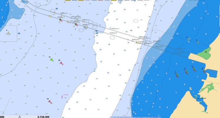
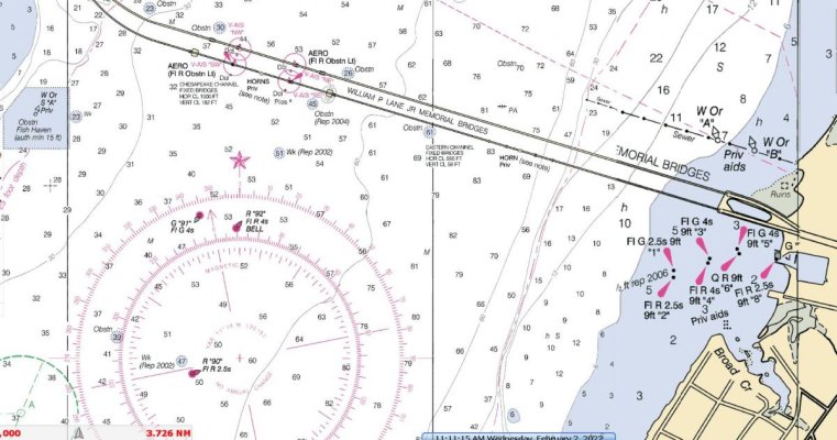
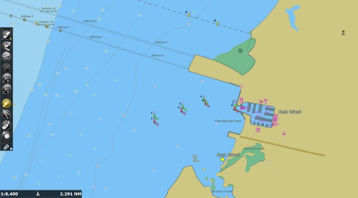
Ahh, I see. Didn’t understand where you were going with it. I will post some pictures of what Time Zero sent me later. Amongst others, I asked for a couple off of Kent Island, Md outside the Marina there by the bridge.
 
These are from TZ for that area, early 2021 update. (Haven't done this year's yet.)

-Chris
 

Attachments

  • bbm1.jpg
    bbm1.jpg
    61.2 KB · Views: 32
  • bbm2.jpg
    bbm2.jpg
    120.7 KB · Views: 36
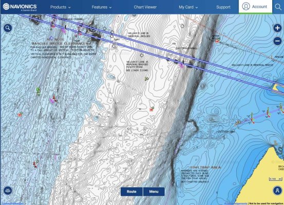
For the sake of comparison, here is what you get from Navionics crowd sourced bathy charts for the same area. You can of course choose lesser detail if it is too much.
 

Attachments

  • Screen Shot 2022-02-02 at 9.19.51 AM.jpg
    Screen Shot 2022-02-02 at 9.19.51 AM.jpg
    203 KB · Views: 25
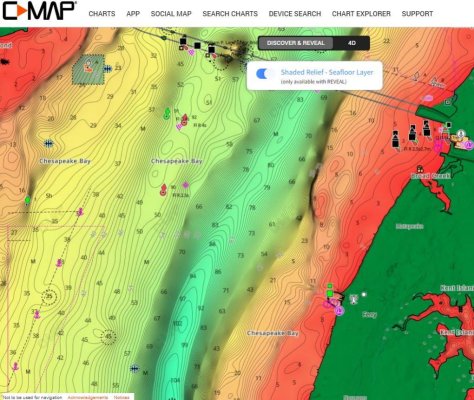
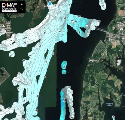
To complete the comparison, hopefully I am correctly posting some C-Map charts

The first is their Reveal - Shaded Relief chart. The second is their crowd sourced chart called Genesis.
 

Attachments

  • C-Map Reveal Shaded Relief Chart.jpg
    C-Map Reveal Shaded Relief Chart.jpg
    156 KB · Views: 22
  • C-Map Genesis Chart.JPG
    C-Map Genesis Chart.JPG
    166.9 KB · Views: 23
Chris, Do you know which chart that is? Thanks, Nate


I don't. The whole quilting process -- and then viewing at different zoom levels -- kind of obscures chart numbers. Haven't really ever looked, but I'm not even sure if there's a way to figure it out.

FWIW, I could turn on more elaborate depth shading within TZ -- like in FWT's first chart -- but haven't ever bothered to do that. (I think it's an option on the Garmin unit on the boat, too, but not positive.)

-Chris
 
Last edited:
That Navionics chart is MUCH more detailed than the standard chart of theirs.

Is that only available to Garmin customers?
 
Ok,

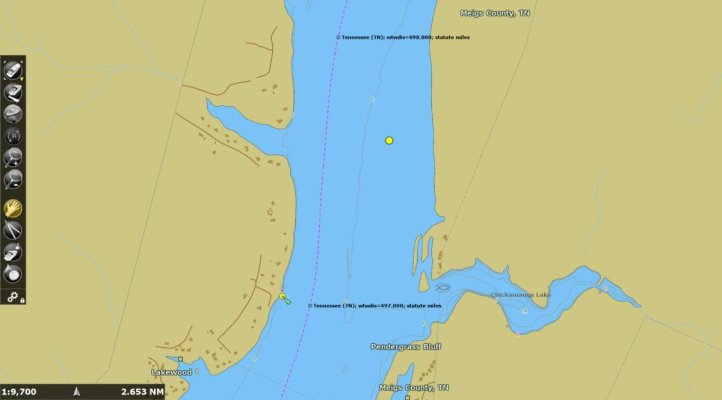
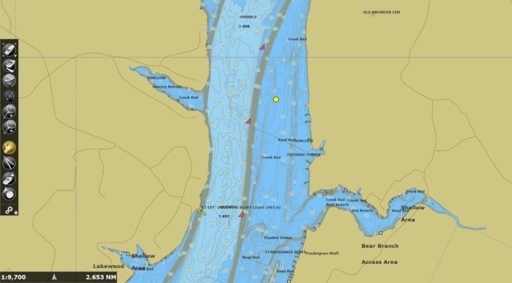
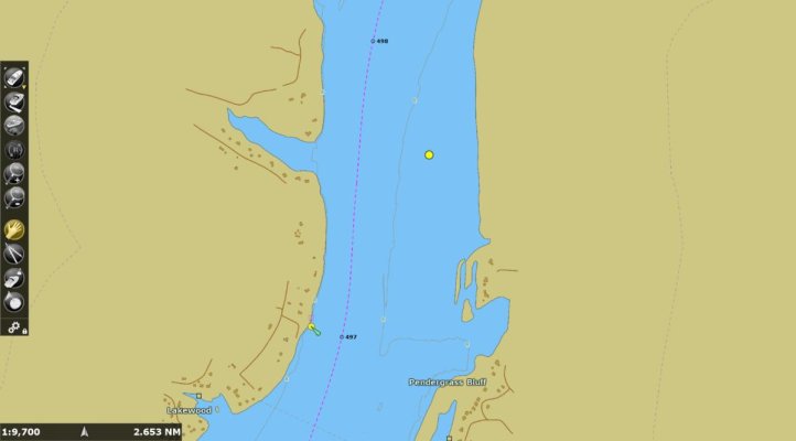
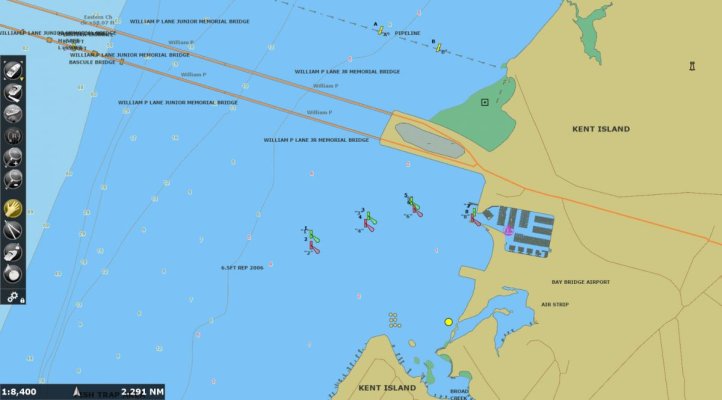
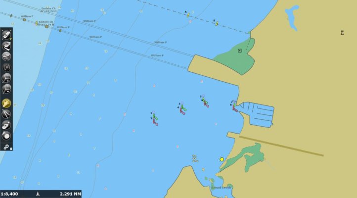
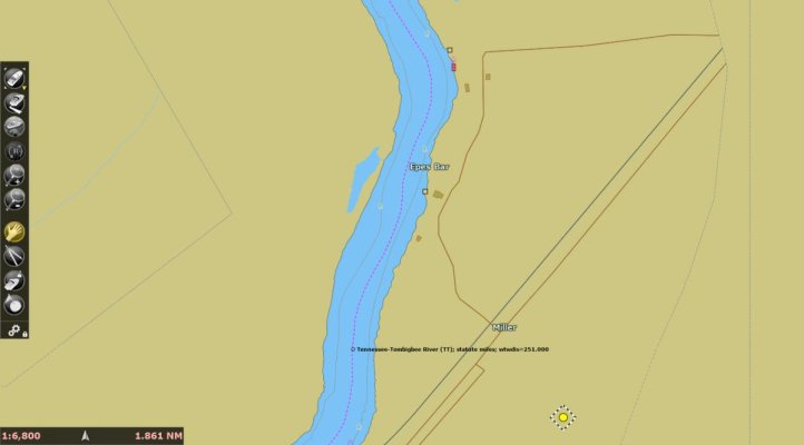
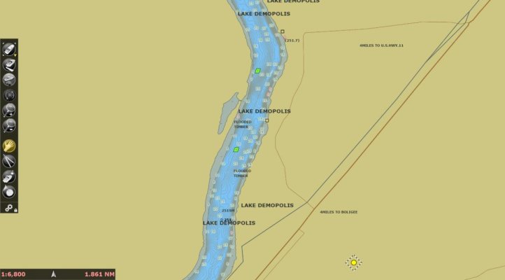
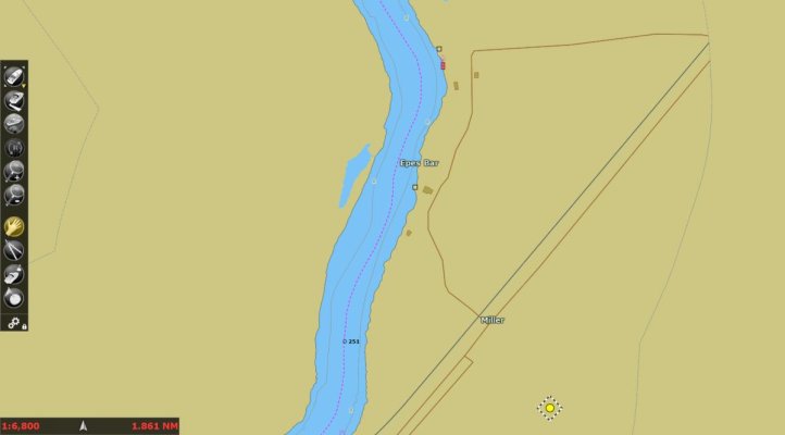
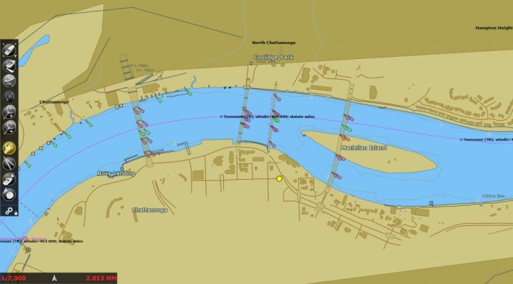
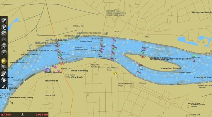
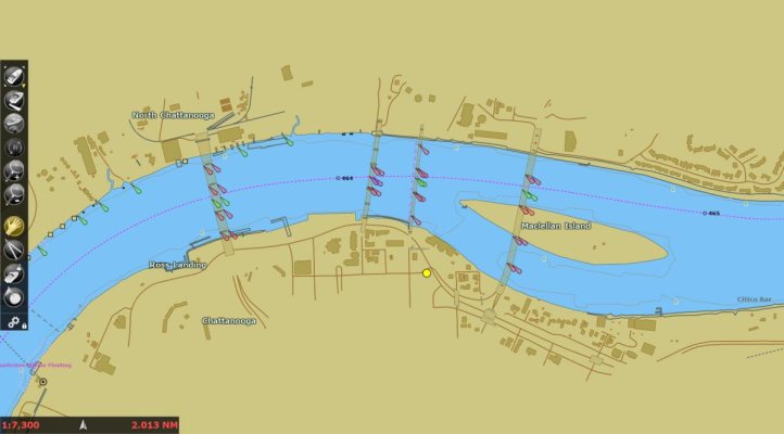
Here are some of the charts that were sent to me. I asked that they be rendered as they would on a TZ3. Of course there are options on the TZ3 to "dress it up", I suppose, but this shows the level of detail for each. The order will be CMap. Navionics, and then NOAA.I will post a couple of other areas in subsequent posts.

Since we have been talking about the area around my home port, I will post those to begin with. Bear in mind that the Furuno version of Time Zero is the 4D version. Time Zero doesn't provide the Discover and Reveal version.
Obviously, I would need Navionics to travel the sides of the river.
 

Attachments

  • 01 CMAP.jpg
    01 CMAP.jpg
    45.4 KB · Views: 28
  • 01 Navionics.jpg
    01 Navionics.jpg
    70.8 KB · Views: 33
  • 01 NOAA.jpg
    01 NOAA.jpg
    37.7 KB · Views: 27
This is the Kent Island area by the bridge in the Chesapeake across from Annapolis MD/ All three choices have adequate depth mapping for me.
 

Attachments

  • 05 CMAP.jpg
    05 CMAP.jpg
    48 KB · Views: 24
  • 05 Navionics.jpg
    05 Navionics.jpg
    60.4 KB · Views: 33
  • 05 NOAA.jpg
    05 NOAA.jpg
    44.9 KB · Views: 33
Here is Demopolis on the way to the gulf down the river system. Again, Navionics appears to be the choice. There other screen prints that show an area on the Mobile River with no depths from from any of the three.
 

Attachments

  • 04 CMAP.jpg
    04 CMAP.jpg
    40.3 KB · Views: 22
  • 04 Navionics.jpg
    04 Navionics.jpg
    45.2 KB · Views: 31
  • 04 NOAA.jpg
    04 NOAA.jpg
    37.4 KB · Views: 25
The downtown Chattanooga charts showed the same issue for CMap and NOAA versus Navionics for each chart.

One thing to bear in mind is the customer service experience I received from Furuno and Time Zero. They were knowledgeable, concerned, spent the time to make sure I understood what was happening, and what their plans are to help mitigate it. They also addressed my individual situation and what I could do in the short term (pre-install).


We will see how things move forward with fixing the issue created by Garmin not renewing the contract with Furuno. As a result of what happened, I won't ever buy Garmin equipment in the future. I wasn't inclined to, because I don't want to be held hostage to their sunsetting regime.
 

Attachments

  • 02 CMAP.jpg
    02 CMAP.jpg
    73.7 KB · Views: 26
  • 02 Navionics.jpg
    02 Navionics.jpg
    103.5 KB · Views: 30
  • 02 NOAA.jpg
    02 NOAA.jpg
    66.5 KB · Views: 26
Usually the detail you've pictured in the NOAA and C-Map charts have been sufficient for our purposes.

We've found the NOAA charts adequate along the ICW, but then too the USACE color shaded recent survey data has also been a big help -- mostly near some of the more squirrelly inlets.

Do the Navionics charts for the ICW in Georgia also present more/better depth data as in your Tennessee River shots? Or, say, Shallotte Inlet and Lockwood's Folly Inlet in SC?

-Chris
 
Let’s be careful evaluating charts based on how precise their contour lines are. What is the data set used to interpolate those from? (There are only a few sources of survey maps that these companies start from). Is it false accuracy? Uncertainty has an advantage in applying caution.

From the international hydrographic organization:
“ Many datasets do not contain sufficient data to allow a model to be built that completely describes the seafloor being reported, or for users to determine the resulting quality. For example, if a model was constructed from depth measurements that are more than 50m apart, it is impossible to assess the shape, location, or presence of objects smaller than 100m. It is possible (although not recommended) to interpolate any data, no matter how sparse, to an arbitrary resolution, such as a 1m grid. However most
of the information in this grid would be an artefact of the interpolation scheme, and would not reliably represent the real world.

If data users do not understand these issues, models may appear to be accurate when they are actually heavily, or even mostly, interpolated. Gridded data can be very visually persuasive, which can result in the erroneous belief that the data are better than they are. Those who construct models like this should carefully document the procedures used in order to inform the potential end user. “

I would state that the mfd and chart providers have a vested interest in making their charts look more detailed than others to sell more units. But how can they be more accurate if it’s based on the same data points? and we will suffer from false precision.

The charting company needs to put these in context with existing survey quality charts. The more data points too the more accurate it will be. It would be nice to see a layer that has verified data points on it.

For the ICO trusted data from crowd sourcing , they want high resolution gps, and motion sensors, etc. pitch, roll, have etc all need to be measured. the only system that appears to match survey quality for recreational boats is the Furuno side sonar with the sat compass, but they will have very limited data sets as the system is new and expensive.

Other systems will be good enough even if falling short of survey quality and certainly better than nothing in remote areas . I just wish there was a consumer reports rating as how good the crowd sourced data is for each chart; if they keep interpolating tighter contour lines it looks accurate but is it? And does that matter?
 
Last edited:
Usually the detail you've pictured in the NOAA and C-Map charts have been sufficient for our purposes.

We've found the NOAA charts adequate along the ICW, but then too the USACE color shaded recent survey data has also been a big help -- mostly near some of the more squirrelly inlets.

Do the Navionics charts for the ICW in Georgia also present more/better depth data as in your Tennessee River shots? Or, say, Shallotte Inlet and Lockwood's Folly Inlet in SC?

-Chris


I don't know. Maybe someone else has experience there. Haven't boated there. We bare boated in the Virgin Islands and the Navionics there concerned me. It was obviously wrong in certain areas. We also bare boated around St Marteen and the Simrad plotter was ok, though I don't remember which charts we had at the time.
 
We had Garmin on our loop boat and it still appears, using Navionics at this point, that they are the cream when it comes to inland. We compared then and were impressed with detail and accuracy vs. others. Still plenty of boats moving through the areas without Garmin.

Now, there are always tradeoffs. Garmin used Explorer charts in the Bahamas but has replaced those with Navionics. (Note that Aquamap and C-map use Explorer). The Navionics replacement is horrific in the Exumas. We first heard about this from a Captain who spends most of his year in the Exumas. He was reporting 9' and 7' on Navionics versus Explorer of 4-5'. So we did our own tests. We have Garmin with Navionics on our Ribs. We found several areas with 1 to 5' difference and in all those cases, the Navionics was wrong. We had the rib in 3' of water (easy to tell the depth in clear water) and Navionics said 6'. This isn't a matter of detail or ease but a matter of running you aground.
 
That Navionics chart is MUCH more detailed than the standard chart of theirs.

Is that only available to Garmin customers?

It is available for free to all on their web chart viewer, and available if you've paid for the chart update (or bought a new chip, for a year) on Raymarine chartplotters. You can get on the web and look at any area you are interested in. You have to activate the "sonar" chart overlay with the button bottom left.

Let’s be careful evaluating charts based on how precise their contour lines are. What is the data set used to interpolate those from? (There are only a few sources of survey maps that these companies start from). Is it false accuracy? Uncertainty has an advantage in applying caution.

From the international hydrographic organization:
“ Many datasets do not contain sufficient data to allow a model to be built that completely describes the seafloor being reported, or for users to determine the resulting quality. For example, if a model was constructed from depth measurements that are more than 50m apart, it is impossible to assess the shape, location, or presence of objects smaller than 100m. It is possible (although not recommended) to interpolate any data, no matter how sparse, to an arbitrary resolution, such as a 1m grid. However most
of the information in this grid would be an artefact of the interpolation scheme, and would not reliably represent the real world.
Now this is what I was alluding to before. How much is real and how much is created?

The information in your quote however is quite technically out of date. Only a decade ago, without very expensive and sophisticated equipment, you would only get spot soundings and your contours would only be as accurate as the distance between them. Now, relatively cheap side scanning sonar can pretty accurately sweep a wide swath, and create an accurate contour map of that swath. The data from these sensors is several orders of magnitude denser than a decade ago. That area is very heavily travelled so we can presume it has been sampled many times, perhaps hundreds of times. I'd tend to believe it there.

Of more concern is a sparsely travelled channel, in which the contours are similarly presented. I'm specifically looking at the Keiku Strait in SEAK which I'm hoping to do this summer. The Navionics data looks pretty good - but what is it based on, how many transits, etc. I wish they would tell us, but instead all you get is "not for use in navigation".
 
Now, there are always tradeoffs. Garmin used Explorer charts in the Bahamas but has replaced those with Navionics. (Note that Aquamap and C-map use Explorer). The Navionics replacement is horrific in the Exumas.

When I was in the Bahamas and Exumas in 2014, on my 6.5' draft sailboat, we had both Navionics and Explorer. The Explorer wasn't perfect, but the Navionics was often a fantasy.

That was before the crowd sourced Navionics "sonar" charts. I wonder if now, much of that has been fixed. Plenty of people transiting those areas, surely that data has been uploaded and incorporated? After all the Explorer data was collected by a couple of people with an old school depth sounder.
 
@DDW
Agree completely.

The IOC paper though was “ Guidance on Crowdsourced Bathymetry” published in 2018. They were making an example though if false precision as many areas hadn’t been resurveyed.

The crowd sourcing point was separate and they still wanted to rate each source on a trust scale, and then cross checking.

They were critical of false precision.
 
Last edited:
When I was in the Bahamas and Exumas in 2014, on my 6.5' draft sailboat, we had both Navionics and Explorer. The Explorer wasn't perfect, but the Navionics was often a fantasy.

That was before the crowd sourced Navionics "sonar" charts. I wonder if now, much of that has been fixed. Plenty of people transiting those areas, surely that data has been uploaded and incorporated? After all the Explorer data was collected by a couple of people with an old school depth sounder.

Well, these findings and experiences are recent and based on the latest Navionics being used by Garmin. Most have been using Explorer in one form or another and suddenly those with Garmin were flipped from Explorer to Navionics and results were dismal.
 
Well, these findings and experiences are recent and based on the latest Navionics being used by Garmin. Most have been using Explorer in one form or another and suddenly those with Garmin were flipped from Explorer to Navionics and results were dismal.

I doubt the Navionics official "legal for navigation" information will have changed. What I'd like to hear is from someone who has been through there with the "sonarchart" overlay switched on. It's one or the other with Navionics, you have to have paid for it, downloaded the data, know it's there, and then activate it.

I just looked at it for some of the Exumas, lots of detail with at least some differences compared to the official soundings.

Lots of detail but many inaccuracies and we and the other captain who first pointed it out looked at the sonarchart as well.

I think one problem is that with crowdsourcing, Navionics hasn't apparently had a good crowd in the Exumas. With everyone using Explorer, I think it hurt their development of accurate readings. Now, switching Garmin over may allow them to improve greatly.
 
It is available for free to all on their web chart viewer, and available if you've paid for the chart update (or bought a new chip, for a year) on Raymarine chartplotters. You can get on the web and look at any area you are interested in. You have to activate the "sonar" chart overlay with the button bottom left.


Ah ha!

Thanks
 
The downtown Chattanooga charts showed the same issue for CMap and NOAA versus Navionics for each chart.

One thing to bear in mind is the customer service experience I received from Furuno and Time Zero. They were knowledgeable, concerned, spent the time to make sure I understood what was happening, and what their plans are to help mitigate it. They also addressed my individual situation and what I could do in the short term (pre-install).


We will see how things move forward with fixing the issue created by Garmin not renewing the contract with Furuno. As a result of what happened, I won't ever buy Garmin equipment in the future. I wasn't inclined to, because I don't want to be held hostage to their sunsetting regime.

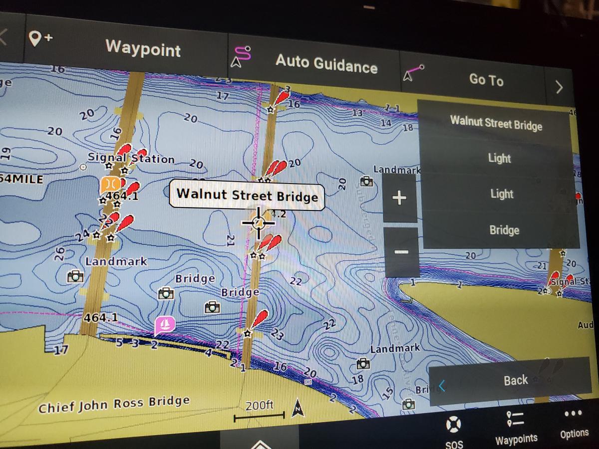
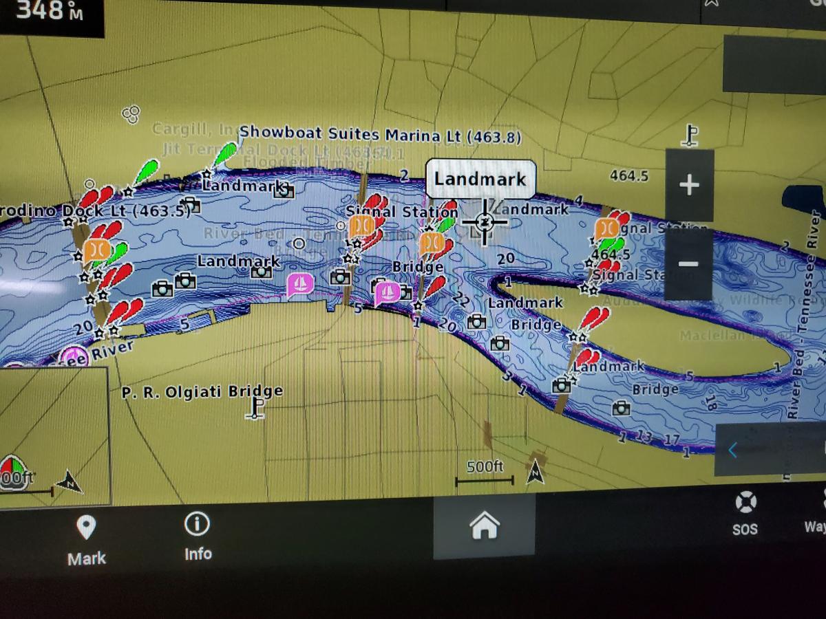
Just for comparison, this is the newest Garmin Product causing all this fuss. Navionics Vision+

23047-albums1084-picture7394.jpg


23047-albums1084-picture7401.jpg


23047-albums1084-picture7400.jpg


23047-albums1084-picture7402.jpg


23047-albums1084-picture7396.jpg


23047-albums1084-picture7397.jpg


This is their crowdsourced Quick Draw maps in a local area to me. Its kept under "fishing charts" presumably not for Navigation.

23047-albums1084-picture7395.jpg
 
I like my chart uncluttered, except for buoys, marina/anchorages, and depth. Of course, in busy waterways, it is good to have AIS turned on. Other than that and the route I am following, pretty simple and less to get absorbed in.
 
I like my chart uncluttered, except for buoys, marina/anchorages, and depth. Of course, in busy waterways, it is good to have AIS turned on. Other than that and the route I am following, pretty simple and less to get absorbed in.


I find the contour lines a bit excessive and cluttering. I suppose they are useful if you are fishing? Maybe others can comment on that.


I also expect the contour lines are interpolations as someone suggested a few posts back, so perhaps suggesting more comprehensive data that what's actually there.

I really agree with you while in somewhat open water, running a course to a destination.

However, on the Chesapeake many of the coves have a lot of tricky shoaling. The cleanest charts do not show it. At all. When approaching those and picking a spot to anchor the finer detail has a lot of value.

So for me its not a case of 100% one or the other, but rather pick your view based on your need at the moment.

Take a look at the Chesapeake, eastern side of the bay, north of the Bay Bridge but south of the canal. Halfway between the bridge and canal. Look at Fairlee Creek and Worton Creek just as two examples. Either local knowledge or chart detail are helpful.
 
I think most implementations allow you to specify how frequent you want the contour lines drawn. Raymarine does as I recall.

That sort of detail is easily acquired with structured sonar, but I'd still like an attribution assigned to it. Like, "average of 20 passes since 2020" or something. All you get from Navionics is "don't use this data".
 
I really agree with you while in somewhat open water, running a course to a destination.

However, on the Chesapeake many of the coves have a lot of tricky shoaling. The cleanest charts do not show it. At all. When approaching those and picking a spot to anchor the finer detail has a lot of value.

So for me its not a case of 100% one or the other, but rather pick your view based on your need at the moment.

Take a look at the Chesapeake, eastern side of the bay, north of the Bay Bridge but south of the canal. Halfway between the bridge and canal. Look at Fairlee Creek and Worton Creek just as two examples. Either local knowledge or chart detail are helpful.


Many moons ago I plowed a new channel in the Chesapeake in a sail boat. My wife keeps reminding me about it.


I think the key is whether the additional contours add useful information. In tight waters as you describe, I can see how it would. In the example chart snapshot that was posted, most seemed to add little value.
 

Latest posts

Back
Top Bottom